Project Site Outline:
- Overview
- Motivation
- Related Work
- Data Sources
- Project Development
- Exploratory Analysis of Mortality Rates and Health Rankings
- Principal Component Analysis
- PCA vs. CHR
- Summarizing Conclusions
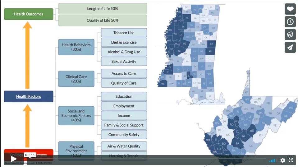
Overview Screencast
Motivation
We are interested in exploring domestic health policy through the lens of county-level health rankings, mortality data, and other relevant determinants of health. Across the United States, there is broad diversity and variation in health status, access to care, and health outcomes.
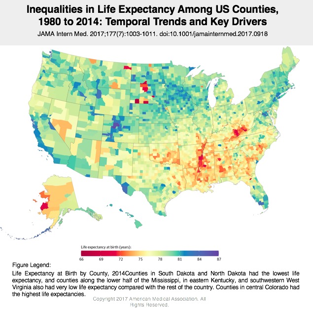
We are curious about the decline of life expectancy in the US (for the first time since the 1990s), and which groups of people (by location, race, income level, or other factors) experienced different changes in mortality and by what cause of death. This analysis could provide insights that could guide targeted health interventions for specific communities in the US.
Related Work
As we embarked on this project, we found that we weren’t the only ones interested in exploring disparities in life expectancy/determinants of health at the county level. Some previous work that helped to guide our project development is below:
- 35 Years of Death, via 538
- Article Summarizing New Findings, via 538
- Cardiovascular disease strongly impacts health in Appalachia and Southern regions of United States
- Death rates are rising for middle age whites
- Increased vehicle deaths in rural areas/longer distances to ERs
- Self harm in Western states
- Self harm data masking violence deaths
- Existence of garbage codes: useless codes and ambiguous death causes
Sources for Data Analysis:
For this project, we used the following data sources (all open access!):
US county health rankings
US county-level mortality data
Project Development
We wanted to dive further into mortality and attempt to understand the factors that contribute to high mortality rates in certain counties. With this in mind, we were curious about performing Principal Component Analysis (PCA) for mortality. We found other literature where this method had been employed to understand mortality in developing countries, cardiovascular deaths among Native Americans, and malaria cases in Ghana.
Research Questions:
- Can we use PCA to understand the dominating factors that drive county-level mortality rates in the United States?
- Can applying PCA help to inform trends in mortality rates at the county level that can be used to tailor context-specific interventions?
Exploratory Analysis of Mortality Rates and Health Rankings:
Counties & States Demonstrating Declines in Life Expectancy
We began by generating a list of counties with the largest decrease in life expectancy. We were seeking more information about exactly which areas in the U.S. had demonstrated the most dramatic decline in life expectancy from 2010 to 2014:
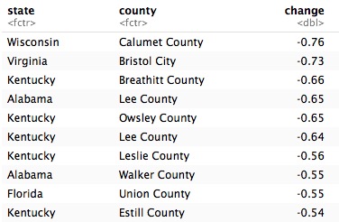
Early exploration at the county level is interesting, but for some additional analysis we want to consider each state as an individual unit of analysis. We know that there is a strong likelihood of individual outliers at the county-level that might skew our results, and considering policy implications at the state-level, we asked the question, “which state had the largest decline in life expectancy during this same time period?”

Both Mississippi and West Virginia demonstrate the largest declines in life expectancy (-0.04 years) from 2010-2011. We decided continue analyzing these two states for a more in-depth understanding of these declines. Now that we are limiting our data to Mississippi and West Virginia, we can refine our unit of analysis and return to the county level. We were curious about the range of change in life expectancy during this time period in each state. What percent of counties had a decline in life expectancy compared to an increase?
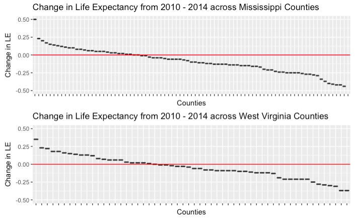
We can see from the graphs above that there were quite a few counties that had a decline in life expectancy. There were exactly 55 out of 82 counties in Mississippi, and 34 out of 55 counties in West Virginia that demonstrated decrease in life expectancy from 2010-2014.
What about all-cause mortality?
The above exploration caused us to want to look at the all cause mortality rates in these two states. We assume that with a decline in life expectancy that we would see an increase in cause mortality.
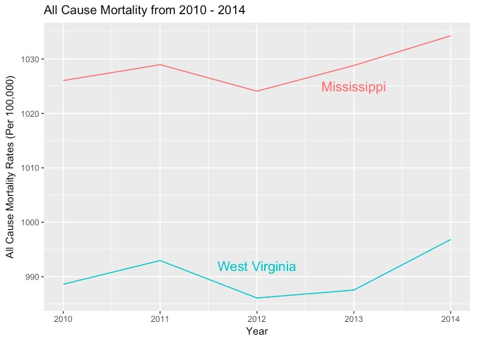
This graph above shows that both West Virginia and Mississippi demonstrated an increase in all cause mortality rates, which corroborates our findings in our life expectancy decline exploration.
Including a “Healthy” Reference State: Hawaii
We did notice, however, that it is difficult to determine from these exploratory analysis how these two states compare from the rest of the country. The y axis all cause mortality ranges from 980 - 1040, which is not a large gap contrary to what it looks like visually. We decided we needed a reference state to compare our two states to. We chose Hawaii to serve as a reference state, which had the highest life expectancy in 2014, and included it in our explorations below.
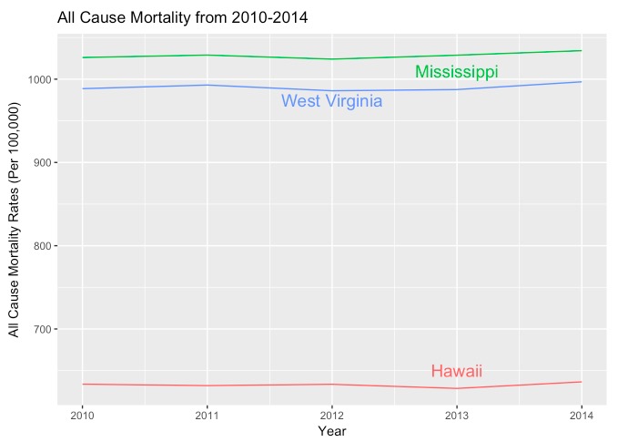
We can now see that West Virginia and Mississippi had very similar trends in all cause mortality rates and that Hawaii, the state with the highest life expectancy, had a much lower all cause mortality rates throughout the five years of data. It is important in these types of graphs to have a reference category to compare to in order avoid making false inferences.
Comparing Life Expectancy Decline and County Health Rankings
How did the county with the largest decrease in life expectancy (in each state) fare in terms of its county health ranking?
-In Mississippi, Grenada County ranked 49th in 2011, and 51st in 2015 out of 55 counties in the state.
-In West Virginia, Logan Country ranked 54th in 2013 and 51st in 2015 out of 82 counties in the state.
Principal Component Analysis
CHR Methodology Informing Further Analysis
Now that we know the two states with the greatest decline in life expectancy are Mississippi and West Virginia, let’s explore what explains the variation among the counties in those states. We know how County Health Rankings approach the 29 health measures, where they group them into four categories and weight them using the following: Health Behaviors (30%), Clinical Care (20%), Social and Economic Factors (40%), and Physical Environment (10%).
We want to see if these group classifications and their weights hold up in explaining the declining life expectancy (and presumably poorer health) in Mississippi and West Virginia. Using PCA, if the 29 measures cluster differently than CHR’s four health factor categories, what kind of story does that tell us? What are shared county characteristics and how might they affect health? How can organizations like CHR take this story into account when computing future rankings, or how can states using information from PCA to address their less healthy residents?
We began by creating a data frame of ONLY z-scores for the 29 variables, for Misssissippi and West Virginia, separately.
In Mississippi:
When we try to use prcomp on variables in Mississippi, we get an error since there are missing values. There are 91 missing values across the 82 counties for MS. We could delete rows with missing data, but then we would lose half of our counties. Instead, we can fill in the missing values with 0s, or the mean. With NAs replaced with 0s, we can try PCA again.
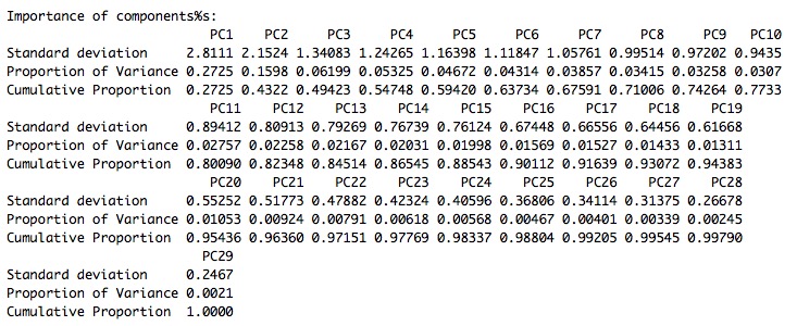
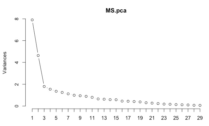
From our summary of PCA for health factors in Missisippi, we see that the first PC accounts for 27.25% of variance. If we wanted to use four components, like the four focus areas that the CHR currently uses, then we would account for 54.7% of total variance. We would need 8 PCs to get to 71%, 11 to get to 80%, and 16 to get to 90%. At 16 PCs, it would be very difficult to keep track of 16 domains for something like the County Health Rankings, and even at 8 it is still unwieldly. Perhaps we should focus on a smaller number of components, but consider what each component is trying to tell us and also try the ‘rule of 1’ and looking at the ‘elbow’ of a scree plot.
The rule of 1, or retaining eigenvalues of 1 or more, would lead us to choosing seven principal components. Looking at the scree plot below, we would choose four principal components, since it appears that the variance levels off after four components.
Let’s look at the loadings on the first four PCs and interpret what the loadings are trying to describe. The measures were color coded by what CHR categorized these measures into to compare their categorization and PCA’s categorization.
First, we created a data frame of the loadings and combine them with the CHR factor categories.
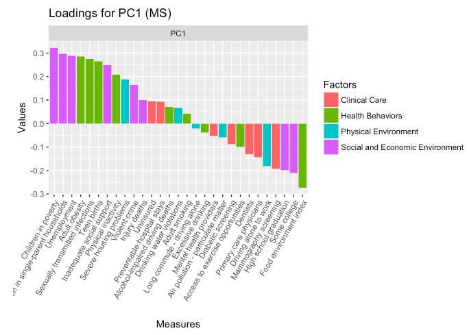
The PC had high positive loadings for children in poverty, children in single parent households, unemployment, adult obesity, STIs, teen births, and inadequate social supports. There was also significant negative loading in the food environment index, indicating higher weights for counties that perform poorly here. PC1 can be interpreted as unstable or poor-resource home environments. It is important to note that loadings with higher measures were categorized as Health Behaviors and Social and Economic Environment had the highest loadings here, suggesting that the two categories may not be so different.
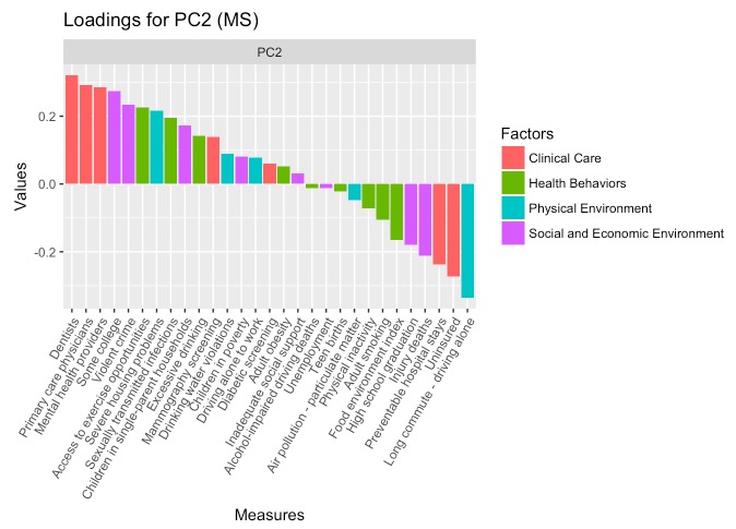
PC2 sees higher positive weights for dentists, primary care physicians, mental health providers, college education, and violent crime. The greatest magnitude negative weights include long commutes driving alone. This PC can be interpreted as density of services, where there is a higher density of health care providers, opportunities for higher education, and incidentally, violent crime. The negative loading on long commute complements the higher loadings, where shorter driving/commuting distances are associted with urban settings.
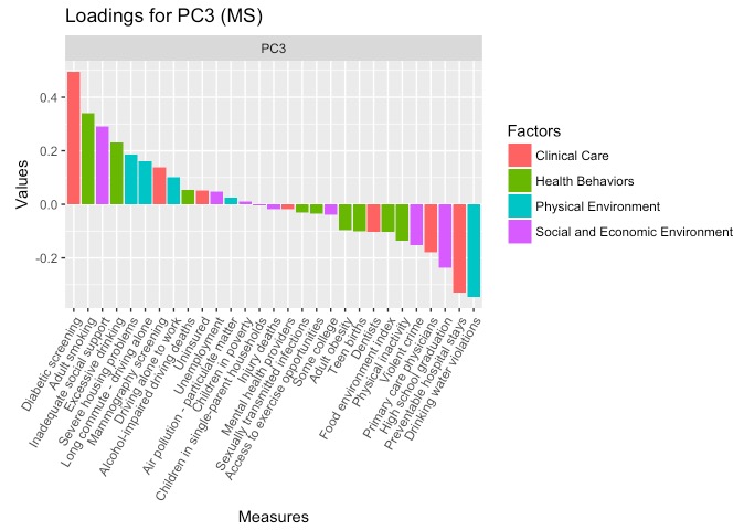
Severe housing problems and being uninsured have high positive loadings for PC3, while driving alone to work and alcohol-impaired driving deaths have high negative violations. CHR’s PHysical Environment categorization is more represented here, followed by one Clinical Care measure (uninsured) and one Health Behavior measure (alcohol-impaired driving deaths). Although this is more difficult to interpret, this PC describes being uninsured against accidents.
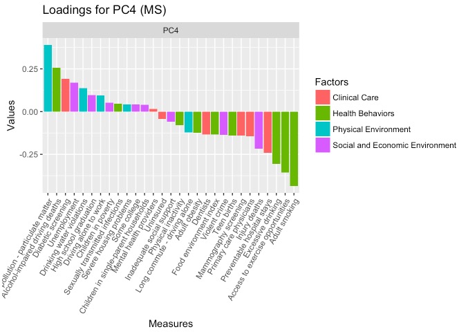
Finally, PC4 sees high loading on air pollution and access to exercise opportunities, again alluding to the urban context but specifically referring to the inability to access the outdoors.
These four PCs can be assigned weights calculated by the percent of variance each PC accounts for divided by the total amount o variance the chosen PCs account for.

The four PCs are the following:
- 49.8% Resource-poor Home Environments
- 29.2% Density of Services
- 11.3% Uninsured
- 9.7% No Outdoor Access
Interestingly for Mississippi, county scores on what CHR considers health measures actually fall into categories of home environemnts, access to providers, insurance, and outdoor activities. Our Principal Component Analaysis that being ‘healthy’ has a lot less to do with whether counties participate in healthy behaviors, but whether there are opportunities for individuals to grow up in healthy environments and seek affordable healthcare when they need it.
In West Virginia:
Now we’ll take a look at the same process for West Virginia.
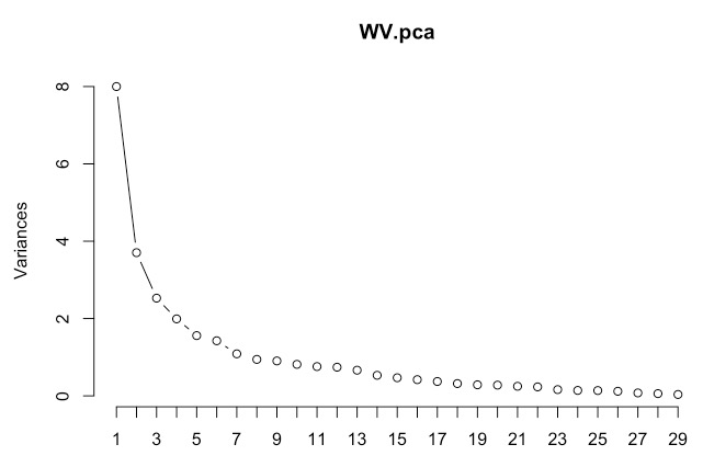
Based on the scree plot, we can choose four principal components again.
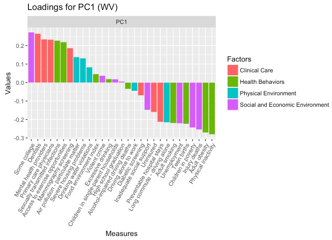
This time, we have high positive loading on some college education, availability of health care providers (dentistry, mental health, and primary care), and STIs and access to exercise opportunities. There is high negative loading on physical inactivity, adult obesity, injury deaths, and children in poverty. PC1 summarizes the domain of having access to health care providers and knowing how to seek care, as well as being more physically active and financially secure. This PC1 can be summarized as health engagement.
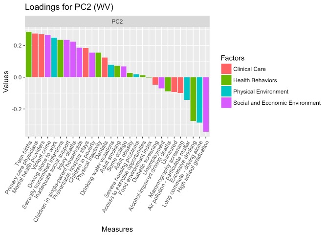
In PC2, more measures have high positive loading than high negative loadings. The positive loadings include teen births, health care providers, violent crime, driving alone to work, STIs, inadequate social support, and injury deaths. Negative loadings include high school graduation, long commute/driving alone, and excessive drinking. This component appears less health related, but rather describes young and poor families in small towns. This is similar to the unstable home environment PC for Mississippi.
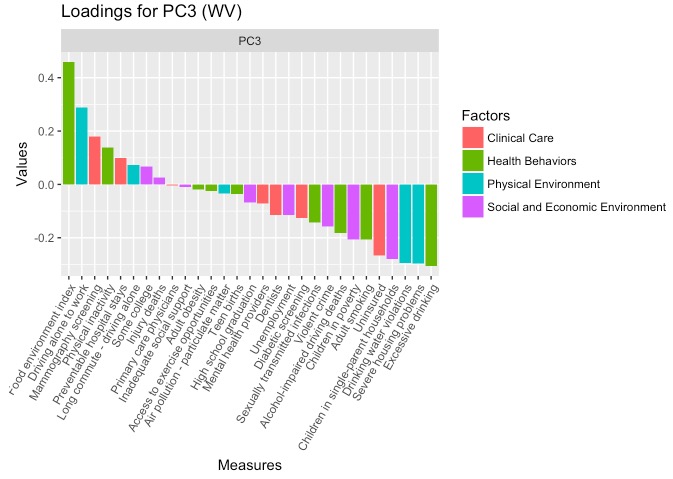
For PC3, there are more negative loadings than positive. Negative loading includes excessive drinking, severe housing problems, drinking water violations, children in poor households, and being uninsured. There is high positive loading for food environment, followed by driving alone to work. This PC describes unhealthy consumption patterns and living in unsafe environments, and can be called toxic consumption.
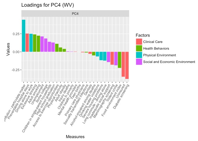
Finally, PC4 describes air pollution (similar to to Missisippi), as well as low diabetic screening and uninsurance rates. This PC is puzzling to interpret, though it should be noted that diabetic screening refers to the percentage of Medicare enrollees (age 65+) who receive HbA1c screening, while the uninsurance rate refers to the percent of the population under age 65 who do not have health insurance. Therefore, this PC might describe counties with younger, insured populations where pollution, and perhaps industry (coal), is present. This relationship was explored further with maps, where areas of low uninsurance arates and high pollution are northern counties bordering Pennsylvania. This PC could be called occupational health.

The four PCs for West Virginia are the following:
- 49.3% Health Engagement
- 22.8% Unstable Home Environment
- 15.6% Toxic Consumption
- 12.2% Occupational Health
County Health Rankings vs. Principal Component Analysis
On the County Health Ranking website, they discuss organizing 29 measures of health into four components and choosing weights based on “scientific research, available data, expert opinion, statistical analysis.” In our Principal Component Analysis, we used a purely empirical approach to analyze the variance across counties in the two states that saw the greatest decline in life expectancy. We wanted to see what matters most to ‘health’ in these states’ counties, and if the weights for the different categories would be different from CHR. However, once we actually performed the analysis on the 29 measures, we realized that the components were describing issues of welfare, the built and physical environment, and access to and engagement with health services. A table comparing the components and weights from CHR and our PCA analyses is shown below:
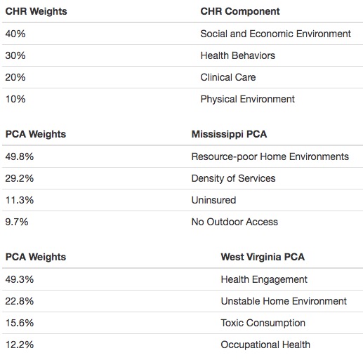
For CHR, a county’s health is determined largely by social and economic environments and health behaviors, which accounts for 70% of their overall health measure. For our PCA analyses, these social and economic determinants appeared in many of the principal components for both states, along with other measures that were considered separate from Social and Economic Factors by CHR– such as density of providers, unsafe drinking water, teen births, and air pollution. Our PCs for Mississippi and West Virginia highlight the social context of these environmental factors, and how they are so interconnected.
For example, our components determined for PCA in Mississippi described the importance of home and physical environments, as well as proximity to health services and being insured against accidents. In West Virginia, the components describe engagement with healthy activities, as well as again, poor home environments or toxic physical environments. These components emphasize the importance of where people live, where location determines the conditions that affect their health (pollution, unsafe housing, exercise opportunities), and how likely it is that they are able to access health services when care is needed (distance to providers and insurance).
Implications for our principal component analyses include focusing on the built and physical environments of communities Improving housing, environmental conditions, and ensuring access (geographically and financially) to health services, are likely to impact communites more than addressing specific health factors like STIs or monitoring diabetes. This contrasts from the implications of CHR’s weights, where physical environment and clinical care are thought to be different from social/economic factors and health behaviors.
What’s next?
With our PCA analyses, we were able to describe new patterns of health determinants and behaviors that differed from how CHR perceives health. CHR states that their mission in creating these rankings is to provide states with information about where and how to focus their energies in improving population health. We hope that a different approach to these rankings using PCA point to other patterns in population health, and encourage a more holistic, social welfare approach to improving health. PCA tells us that what are traditionally ‘health measures’ actually describe social well being as well, which should be a focus in public health efforts.
Project completed by:
- Alex Earle
- Estelle Gong
- Hannah James
- Sohini Mukherjee
